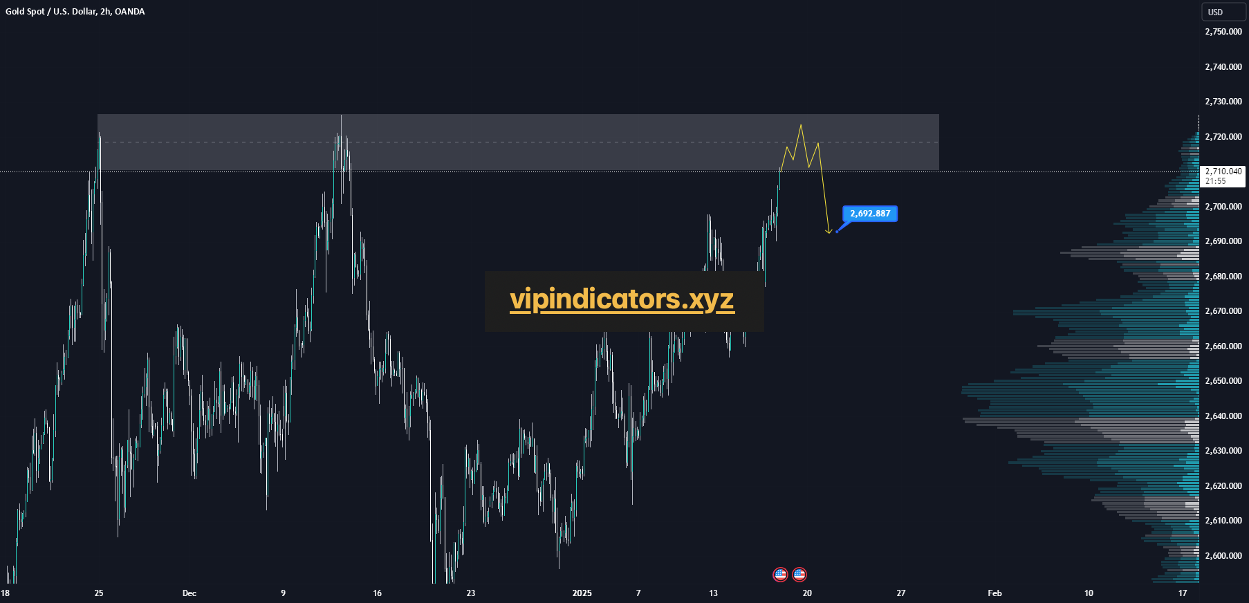
GOLD is at a significant resistance zone, marked by historical price rejections and heightened interest from sellers in the past. If the price confirms a rejection from this resistance level, I anticipate a short-term bearish move toward the 2,692.88 level, which represents a logical target within the current market structure. This setup aligns with the expectation of a correction after a sharp rally into resistance.
Traders should monitor this zone closely for rejection signals, such as bearish candlestick formations or increased selling pressure, to confirm the likelihood of a pullback.
Blog
-
Gold Spot / U.S. Dollar
-
Australian Dollar / U.S. Dollar
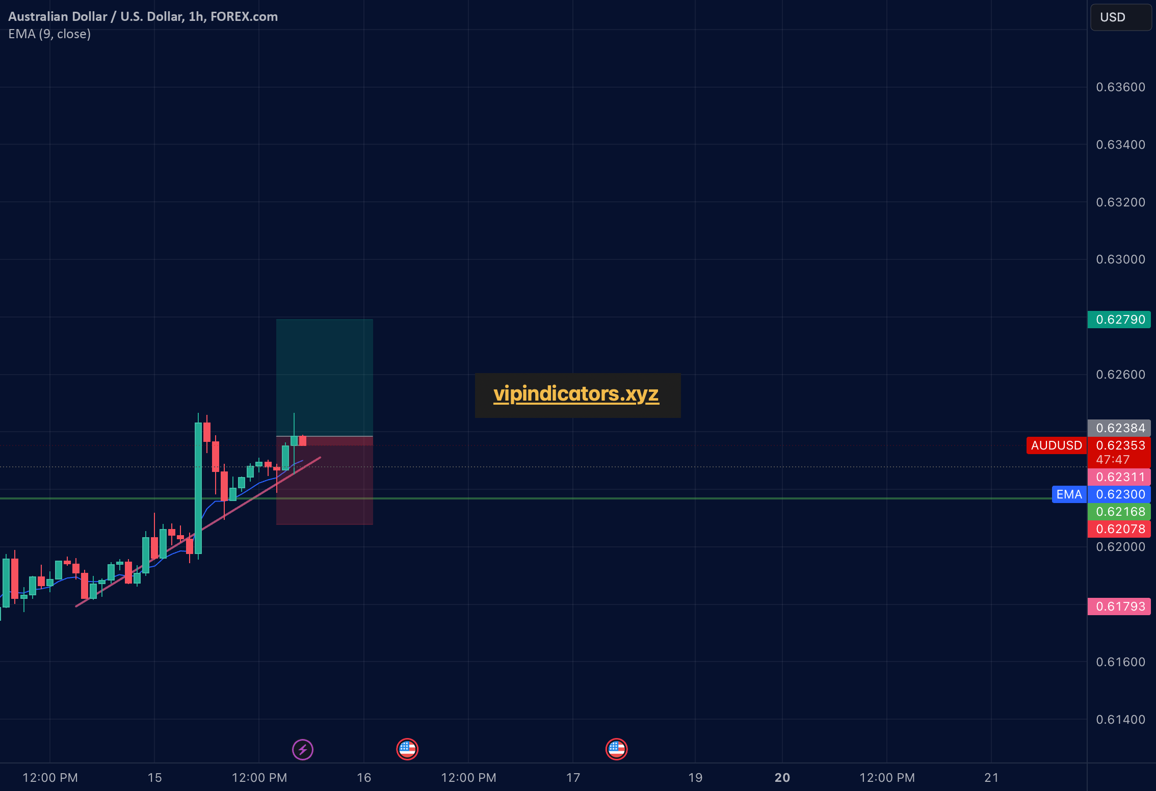
1h uptrend following A 4 hour support, EMA provided support as well.
-
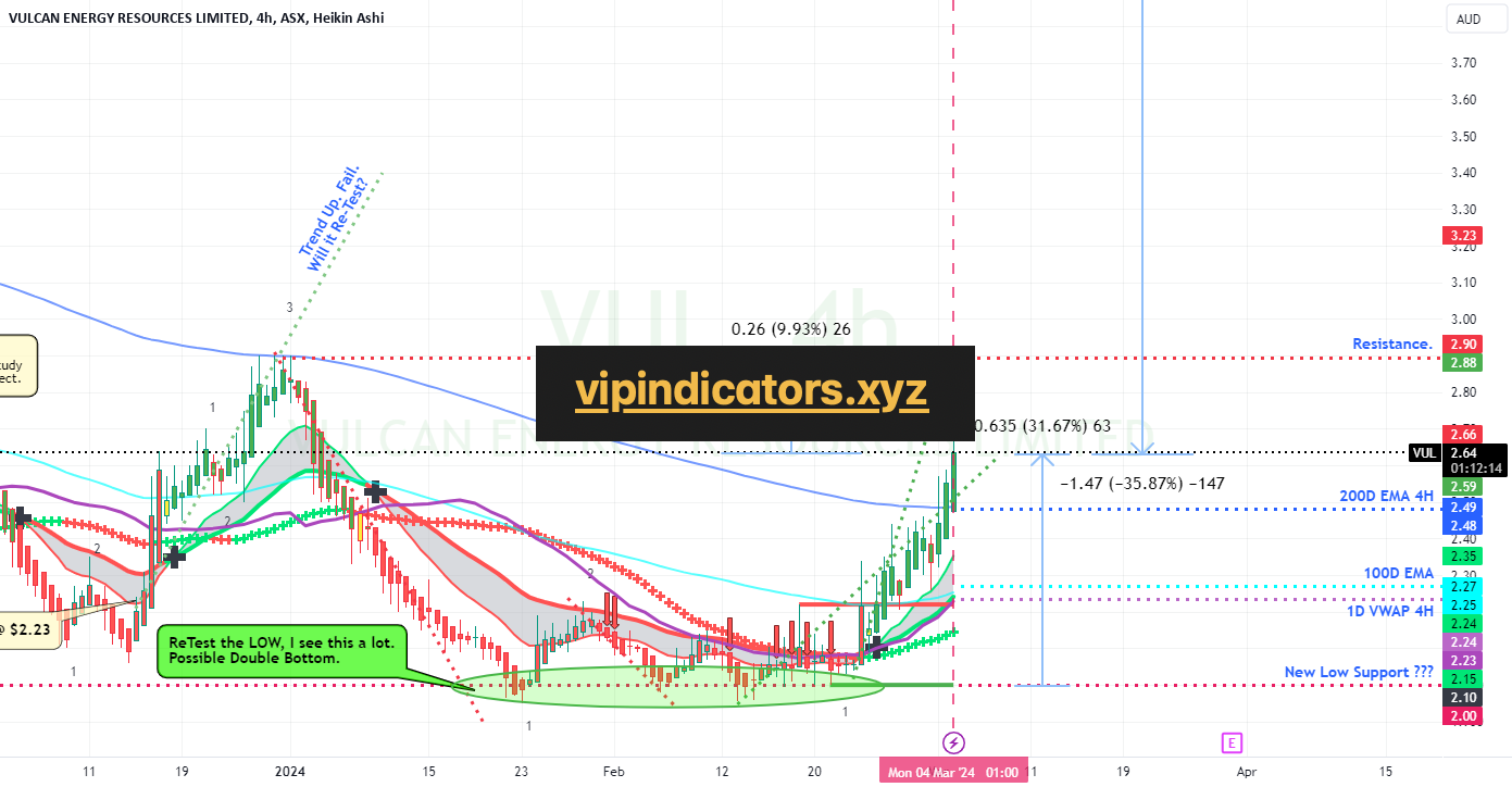
VULCAN ENERGY RESOURCES LIMITED
VULCAN ENERGY RESOURCES LIMITED is up +30% from it’s recent Lows and possible Double Bottom. Still needs a further +10% to break above the last recent High.
The Chart should be self explanatory.
The Lithium miners are seeing a recent boost after a severe Bashing Down and are now might be seen as undervalued.
Congratulations if you got in @ the Lows.
As always, please get a few outside Expert’s Advice before taking Trade or Investment decisions.
If you appreciate my Chart Studies, Smash That Rocket Boost Button. It’s Just a Click away.
Regards Graham. -
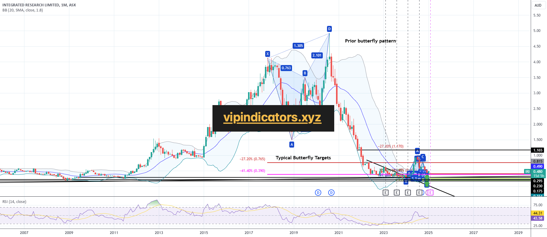
INTEGRATED RESEARCH LIMITED
Monthly chart of IRI (ASX)
Long term Butterfly and trend line support zone -
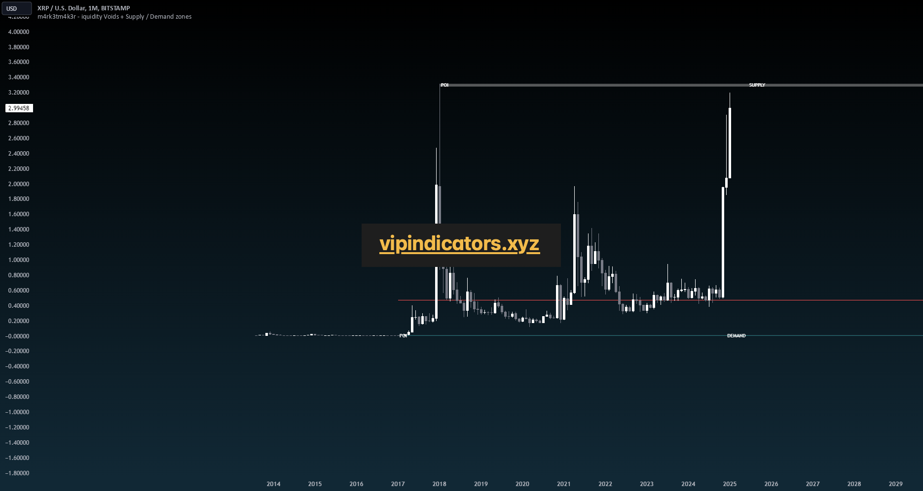
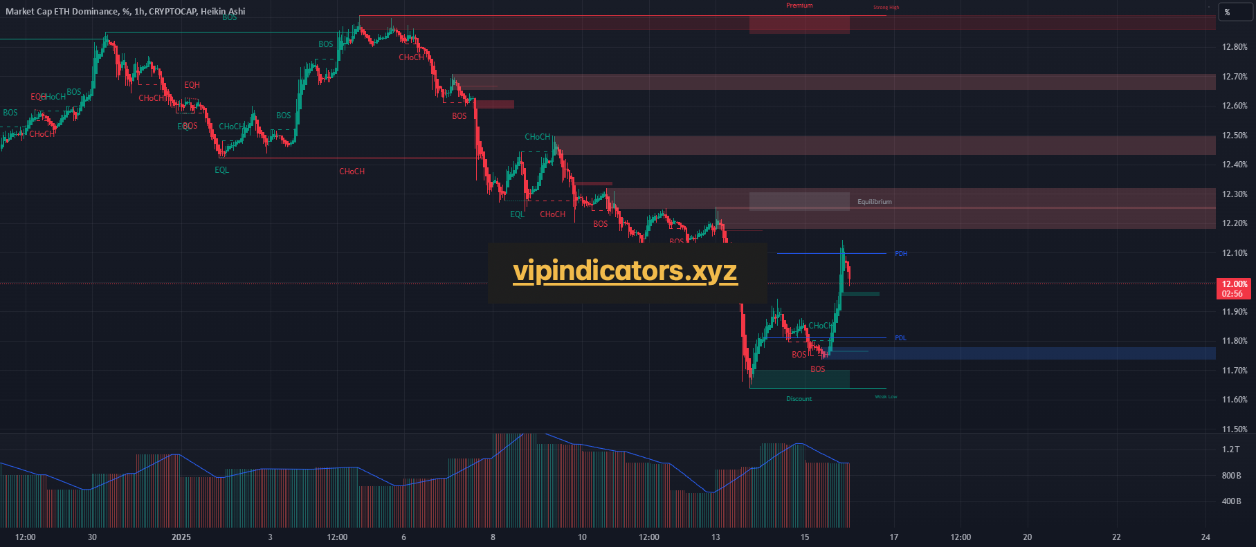
XRP
XRP Approaching Its All-Time High: A Nuanced Look at Potential Roadblocks
XRP has been on an impressive upward trajectory, inching closer to its historic all-time high (ATH). While market sentiment has been generally bullish, there are several under-the-radar factors that traders would do well to keep in mind. Here’s a closer look at some potential pitfalls:
1 – Profit-Taking from 2017 ATH Levels
XRP’s last major price peak dates back to 2017, and a surprising number of traders still hold substantial positions from that era. These traders may have set take-profit targets near the original ATH. As the price approaches these levels, a quick cascade of sell orders could spark heightened volatility or an abrupt price pullback.
2 – High-Leverage Short Positions Lurking
The current hype cycle—fueled by social media chatter and fundamental news—has attracted a flurry of leveraged trading. Notably, some high-leverage short positions have been biding their time, expecting to benefit from any sudden, hype-induced price spike and subsequent correction.
3 – Liquidity Voids and Volume Analysis
Another consideration is around liquidity voids—areas on the chart where trading volume was thin during prior price movements or vice-versa simply too fast to be filled up all at once due to fast upward momentum. These voids can act as magnets for the price, sooner or later requiring a retest or “fill” when market conditions shift.
4 – Finally, there is the reality that exchanges rely on trading activity to make money primarily through fees. If the market becomes too one-sided—say, nearly everyone is going long and few are opening short positions—exchanges may face liquidity imbalances or reduced earning potential from a shortage of counter-parties.
The weekly chart I posted illustrates our current position. Interestingly, the discount zone dating back to 2017 still shows a noticeable imbalance. The red line marks the boundary between premium and discount, which may indicate heightened market interest—especially given that we’re looking at more than seven years of data.
So how should one trade XRP at this point? I’m by no means an expert, but I’ve learned the hard way that trading near all-time highs (ATHs) can be both highly risky and potentially very profitable—a real gamble. One essential lesson I’ve picked up, though, is that as price approaches an ATH, it’s wise to move down to lower time frames for more precise entries and exits.
An example is given by the following set of 0-lagged indicators (some of the have been created by myself and are still in testing mode before to release them publicly)
The above chart shows respectively 4 aspects:
– Liquidity voids and gaps on the M1 time frame
– A somewhat unconventional yet effective way of visualizing volumes (gray lines represent sellers, white lines represent buyers)
– An even more unusual method for detecting volume entries in the second pane. I wrote this indicator to highlight only significant volume spikes, shown whenever they cross the light-green threshold
– Lastly, a simple log-expanded comparison of the inverted price.
If we jump into the m5 TF we can spot additional blind spots:
The 2nd pane of the m5 time-frame is showing a decreasing in volume activities and considering what mentioned earlier, the sellers are winning against the buyers
Let’s now take a look to the m15 time-frame which is one of the most controversial time frame that traders are normally looking at:
– The first pane shows a large liquidity void created by rapid selling activity when the price approached 3.2. From the M15 perspective, it appears this void is pushing the price upward to be refilled. However, M15 volume analysis indicates that volumes are still decreasing, and sellers remain in control as demonstrated in the m5 time-frame.